

How to Love Your Logo
Hooray! So, you’ve just received a shiny new logo package! It’s an exciting time, and the most difficult work has been done.
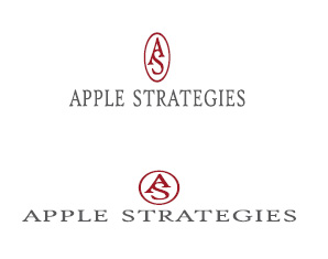
BUT, there are a few things to keep in mind when using with your logo to keep it looking as good as your designer made it. We’ll take a look at a recently designed logo for example. Here’s the original version just below.
![]()
1. Don’t stretch or squash it.
Look back at the original logo. Can you tell that these versions have been squished?
Logos are designed with specific proportions (just like fonts! Read more on that here). You need to make sure that you keep those proportions exactly intact when placing your logo. Human eyes are pretty adept at noticing that an image or text looks “off,” even if the viewer can’t exactly say what it is that’s “off.”
The solution? Simple. When scaling your logo (making it larger or smaller), simply hold the shift key while you drag your mouse. Done. Perfect scaling, every time.
2. Don’t try to edit it yourself.
Logos should be made in specific professional design software. Chances are, if you’re not a designer, you won’t have the software. Please don’t try to edit your logo yourself. Not in Word, not in Photoshop, or any other software that you have access to.
It’s obvious when logos are edited outside of their native software, and the results are not good!
3. Respect its boundaries.
Yes, just like we humans, logos have boundaries. Logos are never offended by bad jokes or funky smells, but they are offended when you don’t respect their space!
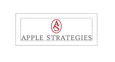
Every logo package should come with a guide for “clear space,” or an area that surrounds the logo that should remain blank. If you’re unsure what your logo’s clear space rules are, look at it’s dimensions, and provide some “breathing room” around it instead of jamming text or photos right next to it. The space between the dotted line indicates the “clear space.”
4. Don’t change colors or fonts arbitrarily.

Just like logos are designed with specific proportions, they are also designed with specific colors and fonts. So, I’ll say it again for the people in the back: Don’t try to edit a logo yourself!
Once you have your final logo, there’s no reason to make further edits. And if you and your designer have gone through the correct process, you should have a logo that you’re happy with and that represents your brand accurately. Therefore, you *shouldn’t need* to edit it.
Do not change a logo’s colors outside of the original design program.Do not change a logo’s colors outside of the original design program.
If you do have a special campaign or event coming up, and you think a secondary logo or alternative logo would be good for marketing purposes, talk to your designer. He/she will be able to help you through the process.
5. Don’t shrink it down to tiny proportions.
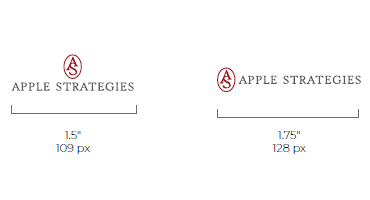
This is another topic that should be included in your logo package. Don’t shrink your logo smaller than the recommended size, or you risk losing detail and image quality.
The diagram here shows the minimum size requirements for this logo set.
Think about it: if you have a logo for a horse ranch, but you shrink it down too small, do you want people say, “Is that a horse or a dog? Maybe it’s a goat? I’m not sure.”
As much as I love horses … and dogs … and goats, this isn’t the ideal situation that you want when your clients are looking at your logo.
So, make sure you keep your fonts and imagery to a legible size. It will benefit you and your clients or customers!
There you have it. Five super-simple tips to keep your logo looking its best. Learn to love your logo by observing these rules, and it will serve you well!
Still have questions? Shoot me an email at kristy@oakrootscreative.com.
CATEGORY
5/01/2019
POSTED
How to Love Your Logo


COMMENT LOVE