

3 Quick Tips for Pairing Fonts
Pairing fonts can be daunting and time consuming. There are so many to choose from — literally tens of thousands of fonts exist today. And what determines what fonts go together? What makes a good pairing versus a bad pairing?
We’re going to break that down today with three tips you can learn in the next 5 minutes!
1. Use a font family
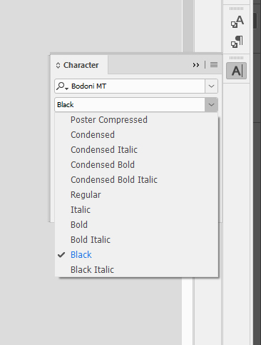
This is by far the easiest and most hassle-free way to pair fonts! Many fonts, like Gotham, Bodoni, and Mr. Eaves come in a “family.” A font family contains a few to many different versions of the same font. So for instance, when you use Bodoni, you can choose from this list:
Using font families can give you a lot of bang for your buck and can create some really sophisticated combinations without looking too scattered. Consider this a go-to solution for many projects!
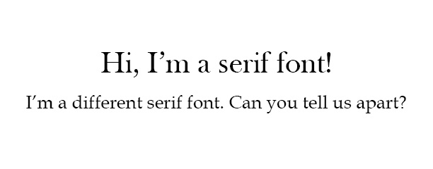
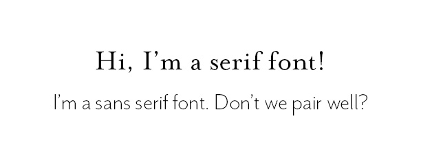
2. Mix serif and sans-serif fonts.
This is all about creating diversity. When you pair fonts, make sure that they are sufficiently different. In other words, someone should be able to tell that there are multiple fonts when they look at the design; there should be no guessing game.
“Is that line a different size, or is that a different font?” Nope, don’t do that — it just confuses people and looks uninspired. An easy way to make sure you differentiate between two fonts is to pair serif with sans-serif.
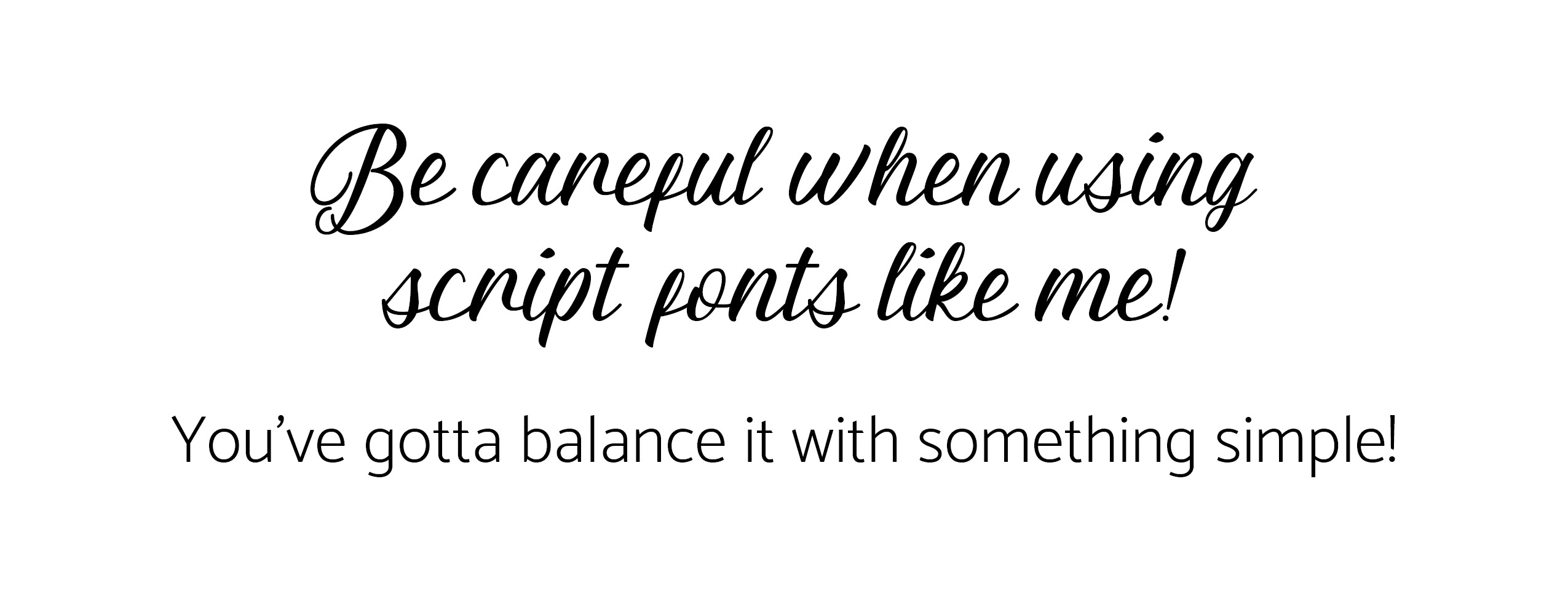
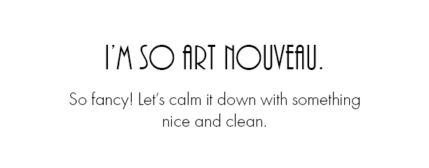
3. Mix font styles (carefully) for some nice juxtaposition.
Think tall fonts with short fonts, thin fonts with thicker fonts, etc. Again, we’re thinking about diversity. Make your fonts look different! Doing so makes both fonts stand out and provides some nice typographic play. Complimentary fonts will bring out the best in each other, just like fried chicken and waffles.
“Wow, look how cool that skinny font looks next to that thick font!”
“That script fonts looks awfully fancy next to that thin, sans serif font.”
I hope this helps you with your project, whatever that may be. Just remember to pay attention to the details of your fonts.
When looking at two fonts, consider if the overall shapes compliment each other. Are the fonts easy to distinguish from each other, or have you created some sort of mixed font soup? (gross). Keep these details in mind, and you’ll be well on your way!
Have questions about what you just read? Just shoot me an email. Or read my other design blog posts.
CATEGORY
11/30/2018
POSTED
3 Quick Tips for Pairing Fonts


COMMENT LOVE